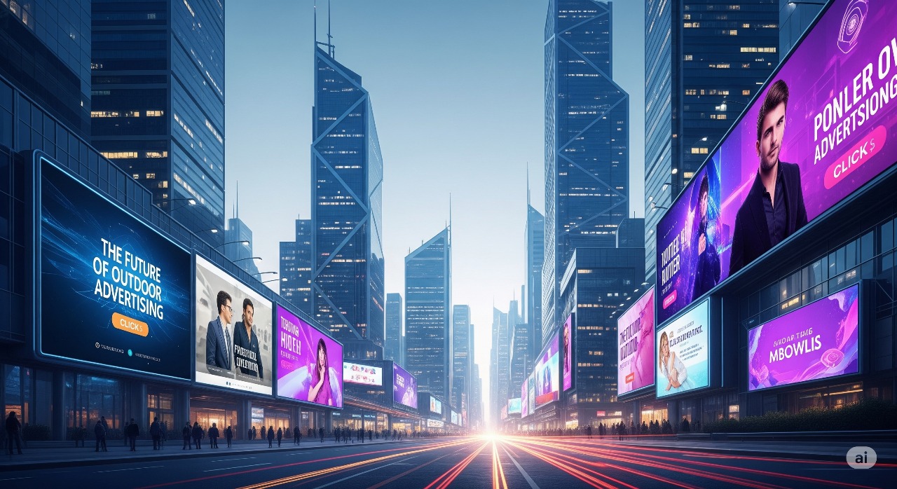
Introduction
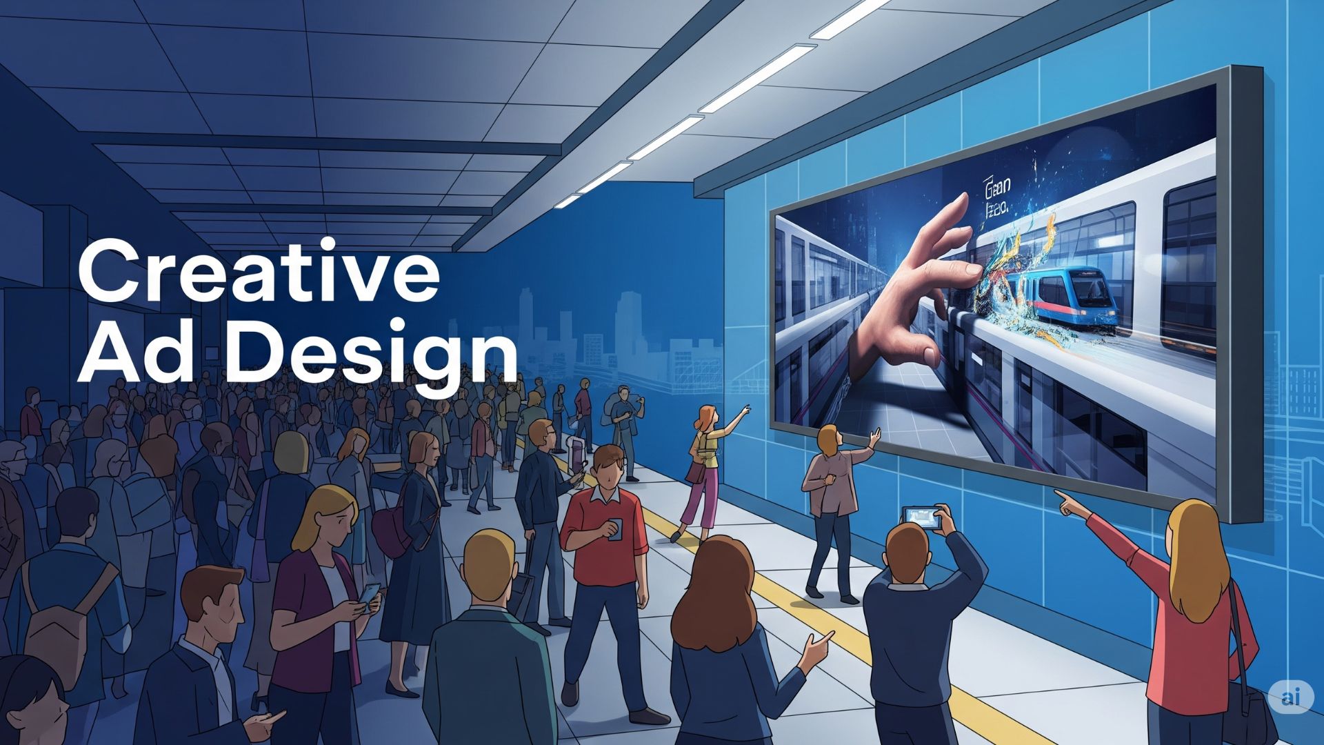
Designing effective advertisements for high-traffic railway stations requires a strategic blend of creativity, clarity, and insight into commuter behavior. With millions passing through train stations daily, advertisers have a unique opportunity to capture attention—but only if their ads stand out amid the busy, often hectic environment.
This article shares actionable tips for crafting creative, impactful ad designs tailored for high-traffic train stations that maximize visibility, engagement, and recall.
1. Keep the Message Clear and Concise
In fast-paced transit environments, commuters often have only seconds to absorb your message.
- Use short, punchy headlines that convey the core message instantly.
- Prioritize one key idea per ad to avoid overwhelming the viewer.
- Employ large, readable fonts to ensure legibility from a distance.
- Use minimal text — people skim ads while rushing or waiting.
2. Use Bold and Contrasting Colors
Vibrant colors grab attention and help your ad pop against the often dull or cluttered station background.
- Select bold, high-contrast color combinations that stand out from the environment.
- Use your brand’s color palette prominently to build recognition.
- Avoid overly saturated colors that may cause visual fatigue in intense lighting.
3. Leverage High-Quality, Compelling Imagery
Images are powerful attention magnets and can communicate emotions faster than text.
- Use large, high-resolution images relevant to your message.
- Show people, faces, or relatable scenarios to create emotional connections.
- Prioritize simple visuals without distracting details for quick comprehension.
4. Design for Visibility from Multiple Angles and Distances
Railway stations have diverse sightlines and commuter movements.
- Ensure your ad is readable from varying distances—large text and clear icons help.
- Consider placement height and angle so your creative works whether seen from afar or close up.
- Use simple layouts that are easily processed from fast-moving viewers.
5. Incorporate Dynamic Elements Where Possible
If your ad is on digital screens or LED panels, make use of motion and animation to increase engagement.
- Use short video loops or animations to capture attention without overwhelming.
- Rotate multiple creatives to avoid ad fatigue during long dwell times.
- Include calls-to-action that prompt interaction, like QR codes.
6. Include Easy-to-Spot Call-to-Actions (CTAs)
Guide commuters on what to do next with clear, compelling CTAs.
- Use action verbs like “Visit,” “Buy Now,” “Scan,” or “Learn More.”
- Place CTAs in high-contrast, prominent areas of your ad design.
- Keep CTAs short and actionable, especially since commuter attention span is limited.
7. Make Use of Station-Specific Context
Create designs that resonate with the station environment or local culture.
- Reference city landmarks, events, or local language phrases for relevance.
- Use seasonal themes during holidays or festivals to create timely appeal.
- Align with commuter lifestyle and interests for better engagement.
8. Optimize for Lighting Conditions
Train stations often have variable lighting—natural light, artificial fluorescents, or dim areas.
- Test your ad under different light scenarios to ensure visibility.
- Use backlit or illuminated formats to enhance night-time visibility.
- Avoid color schemes that fade or blend into the station’s palette.
9. Prioritize Brand Consistency
Consistent visual identity ensures your brand is recognized even in crowded environments.
- Use brand logos, fonts, and colors consistently across all station ads.
- Maintain uniform messaging tone and style to reinforce brand image.
- Use memorable taglines or symbols unique to your brand.
10. Test and Iterate Designs
Gather feedback and measure ad performance where possible to improve.
- Conduct A/B testing for different creatives in select stations.
- Use engagement data from digital ads (touchpoints, QR scans).
- Incorporate commuter feedback and observational studies for tweaks.
Conclusion
Creative ad design in high-traffic railway stations necessitates clarity, visibility, and relevance. By keeping messages simple, using bold visuals and colors, leveraging station context, and optimizing for diverse commuter behaviors, brands can craft compelling ads that cut through the noise and leave lasting impressions.
Investing time and effort in smart, commuter-centric design not only improves campaign effectiveness but also maximizes returns in these one of the most challenging yet rewarding advertising environments.
Ready to transform your railway station advertising? Start by applying these design tips and watch your brand capture the attention of millions on the move.
Frequently Asked Questions (FAQs)
Q1: How long do commuters typically spend looking at ads in train stations?
Dwell time ranges from a few seconds to several minutes, depending on location (platforms, concourses), so ads must communicate quickly and effectively.
Q2: Are animated digital ads more effective than static posters in train stations?
Generally yes; motion attracts attention and allows multiple messages, but static ads still perform well with strong design and placement.
Q3: How can I ensure my ad stands out among many competing visuals?
Use bold colors, simple messaging, high contrast, and unique visuals that differentiate your brand from others.
Q4: Should I customize ad designs for different stations or keep one universal design?
Both work; location-specific customization can increase relevance, while a universal design supports brand consistency.