Introduction
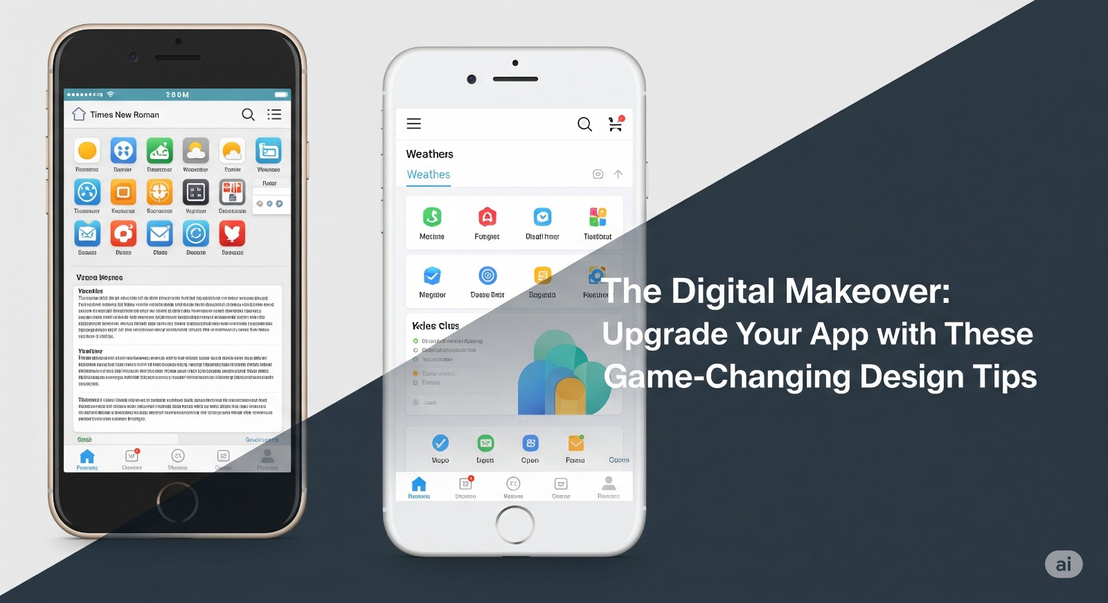
Is your app falling behind the competition or receiving negative feedback on usability? A well-executed digital makeover can revive your app’s fortunes, delight users, and drive long-term success. In this article, you’ll find actionable design tips to upgrade your app’s look, feel, and functionality—ensuring a modern, user-centric experience.
Table of Contents
- Rethink User Onboarding
- Streamline the User Interface (UI)
- Master Mobile Navigation
- Prioritize Accessibility
- Leverage Micro-Interactions
- Optimize Speed and Performance
- Integrate Consistent Branding
- FAQs
- Conclusion & Key Takeaways
1. Rethink User Onboarding
First impressions matter. Guide new users with a simple onboarding flow.
- Use tooltips, animations, or short walkthroughs to highlight key features.
- Keep sign-up forms short; ask for only essential information.
- Celebrate milestones to motivate completion.
Example Question: Have you ever abandoned an app because getting started felt overwhelming?
2. Streamline the User Interface (UI)
- Minimalist Design: Less is more. Remove clutter and focus user attention on core actions.
- Use a clear color palette with high contrast for readability.
- Use whitespace to make screens less intimidating.
- Opt for large, legible fonts and recognizable icons.
Design Tip: Break complex processes into smaller, digestible steps with visual cues.
3. Master Mobile Navigation
- Thumb-Friendly Reach: Place primary buttons within the average thumb’s reach.
- Use bottom navigation bars for ease of access.
- Ensure navigation is intuitive: label icons and avoid hamburger menus for core journeys.
- Always provide a visible way to go back or home.
Did you know? 49% of users rely on one hand to use their phones.
4. Prioritize Accessibility
- Ensure text has sufficient contrast.
- Use ARIA labels for screen readers (especially for custom elements).
- Avoid color-dependent instructions; use symbols and text.
- Support dynamic font sizing for users with vision needs.
Blockquote: “Accessibility is not a feature. It’s a foundation for app inclusivity.”
5. Leverage Micro-Interactions
- Add subtle animations for taps, swipes, and loading.
- Use progress indicators for long tasks.
- Confirm actions visually (e.g., a checkmark for a saved item).
- Micro-interactions build delight and intuitiveness.
6. Optimize Speed and Performance
- Compress images and use vector graphics where possible.
- Lazy-load content that isn’t needed upfront.
- Regularly test your app on older devices.
- Users expect responses in under 2 seconds—delay means drop-off.
7. Integrate Consistent Branding
- Apply brand colors, logos, and tone evenly across the app.
- Define style guidelines for fonts, button shapes, and icon styles.
- Consistency builds trust and makes your app memorable.
8. FAQs
Q: How often should I update the app design?
A: Regularly seek user feedback and adjust design at least once a year or when new platform guidelines are released.
Q: What’s the most common design mistake?
A: Overcomplicating the UI and hiding essential actions under layers of menus.
Conclusion & Key Takeaways
- Upgrade onboarding, streamline UI, and focus on accessibility for a better user experience.
- Integrate micro-interactions and ensure fast performance to keep users engaged.
- Brand consistency makes your app stand out.


