
Meta Description:
Avoid costly errors in your print advertising campaigns. Learn the top print ad design mistakes and how to fix them to boost visibility, trust, and response rates.
Table of Contents
- Introduction
- Why Avoiding Print Advertising Mistakes Is Crucial
- Top 10 Common Print Ad Design Mistakes
- How to Fix or Avoid Each Mistake
- Real Examples: Poor vs. Effective Ad Designs
- How to Review and Proof Your Print Ad Effectively
- FAQs About Print Ad Mistakes
- Conclusion
- Call to Action
1. Introduction
Print advertising is a powerful marketing tool—but only when done right.
A well-designed print ad builds trust, grabs attention, and generates results. On the other hand, a poorly designed ad wastes your budget and reflects poorly on your brand.
In this guide, we’ll highlight the most common print ad design mistakes, explain how to avoid them, and share tips that help your campaigns perform better every time.
2. Why Avoiding Print Advertising Mistakes Is Crucial
Unlike digital, once a print ad is published or mailed, you can’t revise it. That’s why careful planning, designing, and proofing are vital to save time, money, and your brand’s reputation.
Avoiding basic design and communication errors can:
- Protect your ad budget
- Improve response rates
- Enhance your company’s professional image
- Avoid customer confusion or misinformation
3. Top 10 Common Print Ad Design Mistakes
| Mistake # | Description |
| 1 | No Clear Call to Action (CTA) |
| 2 | Too Much Text / Cluttered Layout |
| 3 | Low-Quality or Stocky Imagery |
| 4 | Poor Font Choices / Text Hard to Read |
| 5 | Using Too Many Colors / Inconsistent Branding |
| 6 | Lack of White Space |
| 7 | Print Size or Bleed Errors |
| 8 | Failure to Consider Reading Flow |
| 9 | No Proofreading or Last-Minute Edits |
| 10 | Printing Without a Digital Proof Approval |
4. How to Fix or Avoid Each Mistake
Let’s break down how to correct each one:
1. Include a Strong, Visible CTA
Instead of saying “We’re Open!”, say “Call Today for 10% Off!”
Your reader should know exactly what to do next.
2. Simplify Your Layout
Only include essential headlines, offers, and one strong image.
Less is more.
3. Use High-Resolution, On-Brand Images
Never use pixelated, generic stock photos—invest in authentic, clear visuals.
4. Prioritize Readability
Use 2–3 max font styles; avoid scripts or ultra-thin fonts. Ensure text contrast is strong.
5. Stick to Brand Colors
Avoid rainbow chaos. Use your core color palette + 1 accent.
6. Use White Space Intentionally
Let your design breathe. White space draws attention where it matters most.
7. Follow Print Bleed Guidelines
Designers must add bleeds (usually 3mm or 0.125 inches) to avoid cut errors.
8. Use Natural Reading Flow
Structure content: Top Left → Center → CTA Bottom Right.
It follows our natural eye movement.
9. Proofread Twice
Typos and incorrect info ruin credibility. Always have 2–3 people proofread your final file before printing.
10. Insist on a Digital or Physical Proof
Always request a final proof before committing to large print runs.
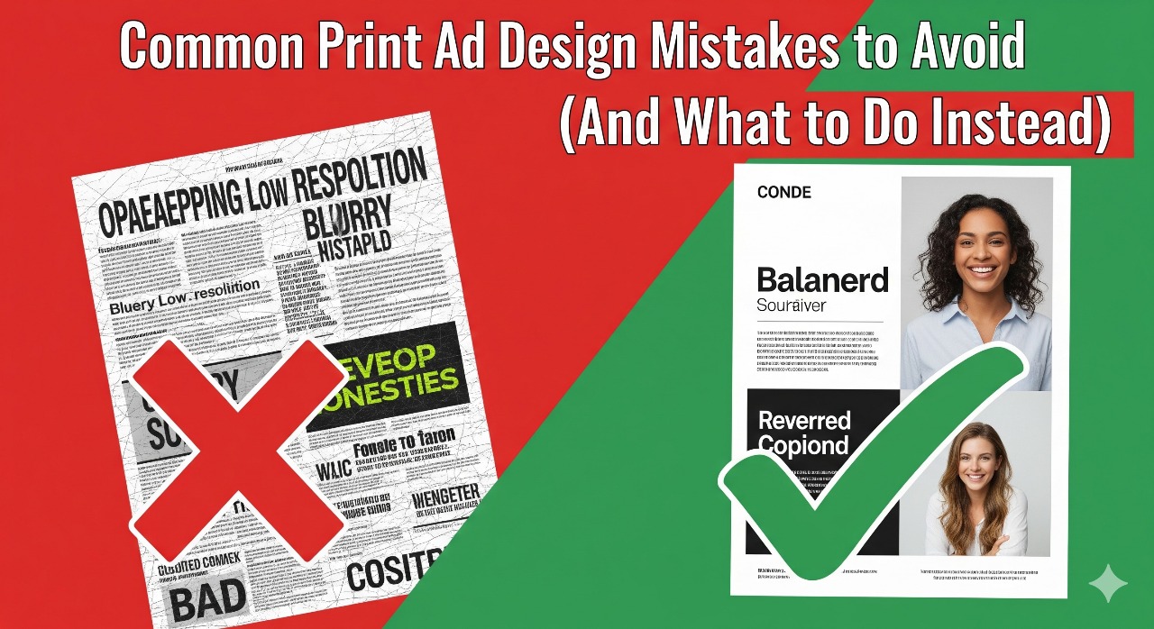
5. Real Examples: Poor vs. Effective Ad Designs
| Poor Print Ad Example | Effective Print Ad Example |
| Too many offers | One clear, exclusive discount |
| Blurry product photo | Crisp lifestyle image of product |
| Hard-to-read script fonts | Clean, modern sans-serif font |
| No CTA, just business name | “Call 123-456-7890 to Book Now!” |
| Out-of-place bright colors | Branded design with elegant tones |
| Text runs to paper edge | Proper margins and spacing |
Add an image/infographic here if publishing online or use a carousel to show visual examples.
6. How to Review and Proof Your Print Ad Effectively
- Review it on screen at full size
- Print it at 100% scale to preview layout
- Check spellings of names, phone numbers, URLs
- View from a few feet away—will it still catch the eye?
- Test by asking: If I saw this as a stranger for 3 seconds, what would I remember?
7. FAQs About Print Ad Mistakes
Q1: What size should my print ad be to avoid distortion?
Use dimensions specific to the print medium (e.g., standard A4, US Letter, or magazine ads). Always export in 300 DPI resolution.
Q2: How can I balance creativity and clarity?
Be creative with layout and color—but always prioritize legibility, brand consistency, and visual hierarchy.
Q3: Can I design print ads using online tools like Canva?
Yes, but ensure you meet professional print standards—CMYK color mode, bleed setup, and high-resolution exports.
Q4: Who should approve my print ads before printing?
At least 2 team members, including your marketing manager or someone unfamiliar with the campaign (fresh eyes catch more).
8. Conclusion
Avoiding these common print ad mistakes can save you from budget losses and brand missteps. A clean, well-designed, and focused print ad not only grabs attention but also earns results in the form of trust, interest, and conversions.
Remember: It’s not just about how your ad looks — it’s how it works.
9. Call to Action
Want help designing professional, mistake-free print ads for your next campaign?
Contact our expert team for creative design and print services tailored for you.
Or Download our easy-to-follow checklist: “10 Print Ad Mistakes to Avoid.”
SEO & Engagement Highlights:
- Keyword usage: “common print ad design mistakes,” “how to fix bad print ads,” “print marketing design tips”
- Clear bullet points and numbered lists aid readability and featured snippet eligibility
- Visual example section increases engagement (add graphics/table in blog CMS)
- FAQ section targets practical user concerns
- Strong CTA encourages leads or downloads